You should see my type closet. It’s pretty big. I have sporty type and strappy type. Workhorse type and formal type. As a graphic designer, I’m constantly trying on new typefaces, falling in and out of love with typefaces, and wondering if this typeface makes my brochure look fat. Of the thousands of typefaces in my collection, I use maybe 50 on a regular basis.
Let me quickly pause to make a terminology distinction. I’m constantly guilty of referring to typefaces as fonts and vice versa. What’s the difference? Type designer Stephen Coles put it like this: “When you talk about how much you like a tune, you don’t say: ‘That’s a great MP3’. You say: ‘That’s a great song’. The MP3 is the delivery mechanism, not the creative work; just as in type a font is the delivery mechanism and a typeface is the creative work.” Got that? The nuance can be subtle.
So, of these favored 50 go-to typefaces, there are a handful of classics for sure: Futura (1927), Helvetica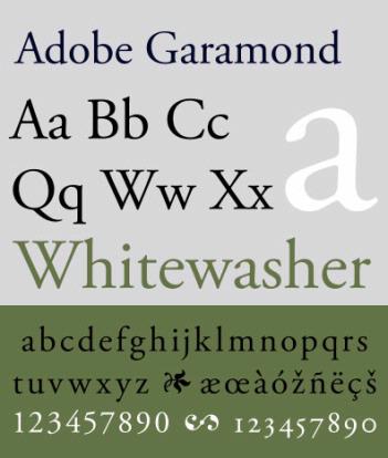 (1957), Garamond (1540’s), Caslon (1720’s). But a disproportionate amount of my favorite typefaces were designed in the last fifteen years and come from a single type studio: Hoefler & Frere-Jones in New York. I’m not alone in my admiration. Pick up any magazine and see typefaces like Gotham, Whitney, Archer, Knockout and Mercury adorning page after page, advertisements and features alike.
Gotham particularly gets a lot mileage and some might say overuse. Tumblr blogs are dedicated to archiving the surplus of Gotham-based corpororate logos. It’s often referred to as the new Helvetica, and not necessarily in a good way. It was designed in 2000 for GQ magazine, but Gotham really took off when the 2008 Obama campaign team adopted it as their flagship typeface. The bold, clean lines and perfect proportions of HOPE and CHANGE typographically defined the moment. Never before had a political candidate used type so successfully to brand a campaign. But, having done that, how would they reboot for the re-election campaign?
A few months ago, a post appeared on H&FJ’s Facebook page begging the question, “Can we add serifs to Gotham?” They self-responded: “For the President of The United States? Yes We Can.” The accompanying image was the new white OBAMA BIDEN logo set in a field of blue, each letterform, save the ‘O’, touched with a fat slabbed serif.
![]()
The comments section lit up with some immediate praise but also derision from the Dylan-goes-electric purists who felt a sacred typographic cow had been tipped. One poster remarked “Serifs and Gotham go together like crisp bacon and vanilla ice cream.” Well, maybe that was meant to be a compliment. But it struck me as incredible that the top type studio in the country made a custom typeface for the President’s re-election. And not just any custom typeface, but a riff on their greatest hit, a variation on their most popular theme. I couldn’t help but start mentally setting the new typeface for my own clients, imagining it in my own closet.
But while H&FJ may have a soft spot for the President, they’re happy to take Mitt Romney’s money.
You may recall the smartphone app that the Romney campaign released earlier this year that became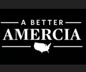 notorious because it contained the misspelled phrase “A BETTER AMERCIA”. When I saw that screenshot, my first thought was “Hey! That’s Mercury!” So I checked the Romney site and, sure enough, his campaign’s lead typeface is Mercury in all its pointy-serifed glory.
So a single type studio is supplying all of the faces for this campaign. But, unlike President Obama, Mitt Romney still has to buy his off the rack.
And the Romney type styling is all over the place. Tight spacing, wide spacing, all caps, uppers and lowers—they’re really throwing the kitchen sink at this on their homepage headlines. Clearly Romney’s campaign is trying to compete with Obama’s campaign type aesthetic and they’re coming up short.
But until I get a presidential campaign as a client I have the privilege of sitting back and judging their type decisions. Campaigns are superbrands now. The managers of these brands know that good typography plays a significant part in the public’s perception of their product. It’s a big job. I’ll stick to focusing on my own type projects, one letter at a time.