The death of author and illustrator Maurice Sendak, as well as Hayley Wood’s perceptive essay on illustrations in children’s books, reminded me of a visit to the Harvard Bookstore in Cambridge. My son was about 3 at the time and it was one of those parenting moments that makes you swell up with pride. As we were browsing, he said, “That book looks like it’s by Sendak.”
Did you see why I was overcome with pride? If not, perhaps you don’t have a PhD in art history. He was demonstrating connoisseurship! Or to put it in a less snobby way, he was recognizing style in art.
Giovanni Morelli (1816-1891) was one of the first art historians to explicate how he identified different artists’ styles. Morelli was convinced that details that were constantly repeated but not the main focus of attention, like ears and hands, would bear the imprint of the artist. I tried to ask my son how he recognized Sendak, but he was too young to articulate his observations.
Still — is it unusual for a three-year-old to recognize artistic style?
Maybe not. For years, young readers had recognized the “good duck artist” who drew Donald Duck comics. Those early Disney comic books did not include writer or artists credits, but legions of kids knew they would be getting a good read if the “good duck artist” — Carl Barks — had been at the drawing table.
Personally, the first time I remember consciously fixating on style was when I was reading comic books in the 1980s. My favorite magazine was called the New Teen Titans, drawn most months by George Perez. I loved (and still do) Perez’ art. I loved that each character had an individual body shape and distinct facial features — I could easily distinguish the three main superheroines by the shapes of their eyes (shades of Morelli’s ears!).
Comics are where I understood style, but illustrated children’s books probably began the process. It’s not hard to find stylistic families among these artists. Jaime Hernandez’ figures from his comic Love and Rockets have the expressive line weight and painted blacks of Maurice Sendak.
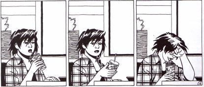
from Jaime Hernandez’ Love and Rockets
Sendak’s In the Night Kitchen (1970).
Mike Grell’s sexy heroines from The Legion of Superheroes seem to have a common ancestry with Trina Schart Hyman’s princesses.
sketch by Mike Grell
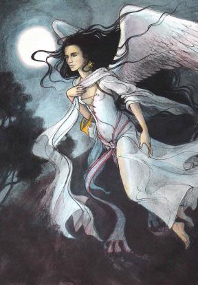
From King Stork, by Trina Schart Hyman (1973).
These stylistic families could go even further back in time. Hernandez and Sendak’s characters share the volumetric qualities of Raphael’s cherubs; Grell and Hyman’s women seem descended from Botticelli’s muses.
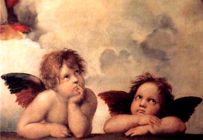
Detail from the Sistine Madonna, Raphael
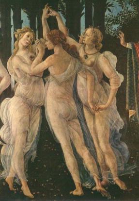
Detail from Primavera by Botticelli
Clearly, style is apparent to kids. They recognize it, and they respond to it, consciously or not.
It’s because of this, that I hate my kids’ Pokemon paperbacks, Berenstain Bear morality tales and the newer edition of Golden Book stories inspired by Disney.
I hate Pokemon books (and Strawberry Shortcake and numerous others) because they take original art, make them generic and easy to repeat for animation (a medium that requires dozens of artists drawing the same figure hundreds of times), and then use that animated style to illustrate books. Cels, the individual drawings that make up animated films, only last on screen for 1/20 of a second so the loss of detail and style is not atrocious, but looking for long periods of time at a similarly crude drawing printed on paper can be disheartening, to say the least.
Similarly, the Berenstain Bears were wonderful characters, fuzzy and breezy in their original stories, but when sanitized into a “house style” that could be easily reproduced, the fuzzy lines become closed shapes, the better to be colored by animators in South Korea or Photoshop’s Magic Wand Tool.
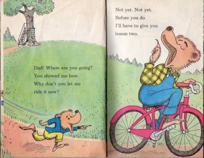
Hand drawn fuzziness! From The Bike Lesson (1964)
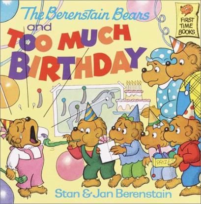
Too much generic line art (1986)
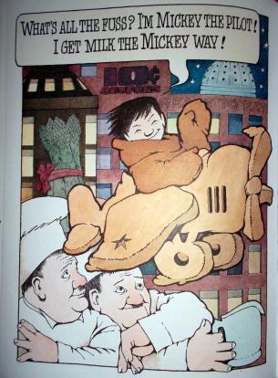
Classic Golden Book adaptations of Disney movies contained beautiful, original watercolors, sometimes just as marginalia, as in their edition of Pinocchio. But some of these have changed. According to Amazon.com:
“The most beloved princess movie of all time—Disney’s Cinderella—is retold in the classic Little Golden Book format. It’s perfect for Disney Princess fans ages 2-5, and available just in time for the movie’s Diamond Edition DVD and Blu-ray release in fall 2012”
But which would you prefer? The frozen animation style of the newer edition, or the hand drawn sensibility of the earlier?
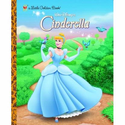
Pretty… bland. 2002 edition
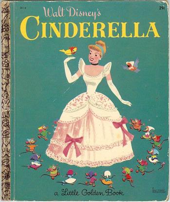
Intriguingly stylish, from 1968
The problem with the newer frozen animation style illustrations are that they serve the story, but do not independently excite and stimulate the viewer’s mind. Sendak’s books can be read over and over again, sometimes with a new storyline just by following the story of the little white terrier. Hyman’s figures often have a conflicted inner life that is missing from the standard fairy tale.
Children’s minds are open to fully developed, idiosyncratic artistic styles, and it’s in their youth that they will determine whether they believe art exists merely to illustrate of a plot point, or if images can be as deep and fulfilling a narrative medium as text. To put it another way, too many generic children’s books use art just as adjuncts to a simple paragraph; the work of Sendak and Hyman and other great art for kids teaches that pictures are worth a thousand words.